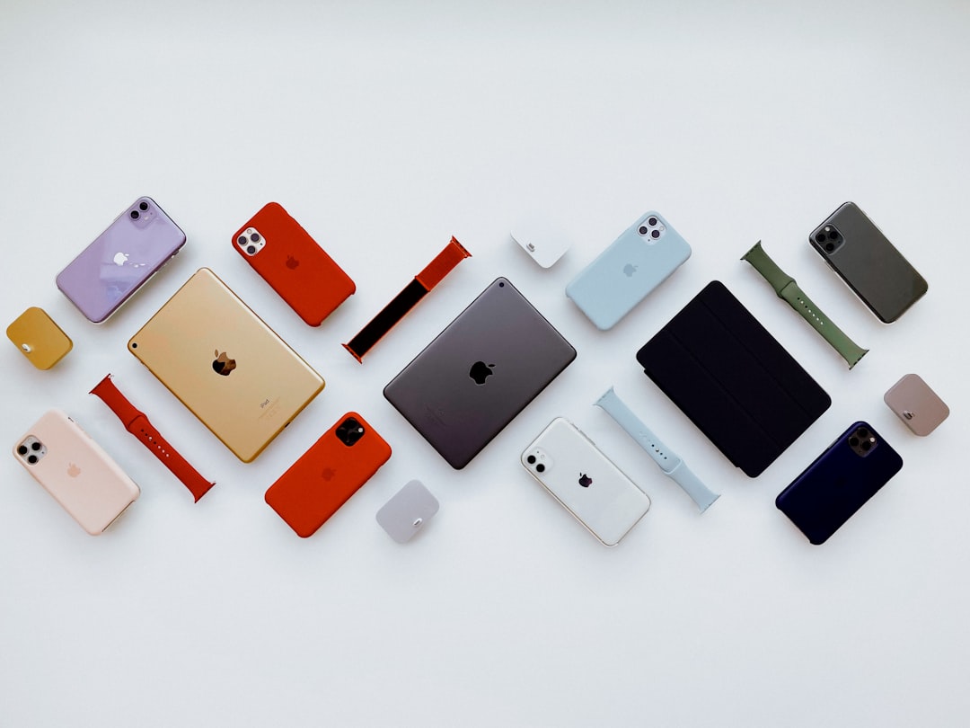
Apple’s visual language has influenced designers for decades because it balances restraint, clarity, and emotional precision. Its palettes rarely feel accidental: whites are warm enough to avoid sterility, grays are layered rather than flat, and accent colors are used with discipline. For designers, studying Apple-inspired color palettes is not about copying a brand; it is about understanding how color can support usability, premium perception, and long-term visual consistency.
TLDR: Apple-inspired palettes are built on clean neutrals, controlled contrast, and carefully selected accent colors. Designers can use these palettes to create interfaces, identities, and marketing materials that feel modern, reliable, and refined. The strongest approach is to start with a neutral foundation, introduce one or two purposeful accents, and maintain consistency across digital and physical touchpoints.
Why Apple-Inspired Palettes Work
Apple’s design reputation is often associated with minimalism, but its color strategy is more sophisticated than simply using white space. The company uses color to reduce friction, focus attention, and create a coherent product ecosystem. Whether in macOS, iOS, product packaging, or retail environments, color is applied with an evident hierarchy.
The core principle is restraint. Most Apple-inspired palettes rely on a quiet base: off-white, soft gray, charcoal, silver, and black. These tones provide room for product photography, typography, icons, and interface states to stand out. Accent colors, when present, are vivid but controlled. They highlight actions, communicate status, or add personality without overwhelming the composition.
The Core Components of an Apple-Inspired Palette
A reliable Apple-inspired palette usually includes the following components:
- Primary neutral: A clean white, warm white, or very light gray used as the main background.
- Secondary neutral: A slightly deeper gray for cards, panels, dividers, or inactive interface elements.
- Text color: A dark gray or near black that provides strong readability without appearing harsh.
- Accent color: A single saturated tone used for buttons, links, highlights, and key calls to action.
- Support colors: Limited secondary accents for warnings, confirmations, charts, or product variants.
This structure helps designers avoid arbitrary color decisions. It also supports accessibility, because each color is assigned a practical role. A palette is not only a set of attractive swatches; it is a system for making decisions.
Palette 1: Classic Silver Minimalism
This palette is inspired by Apple’s long-standing association with aluminum, glass, and clean industrial design. It works especially well for technology brands, SaaS platforms, architecture studios, and professional services.
- Soft White: #F8F8F6
- Light Silver: #D9D9D6
- Graphite Gray: #5F6368
- Near Black: #1D1D1F
- Calm Blue Accent: #0A84FF
The strength of this palette lies in its quiet confidence. The light tones create openness, while graphite and near black establish authority. The blue accent should be used sparingly, particularly for interactive elements such as buttons, navigation states, and links.
Palette 2: Dark Mode Precision
Apple’s dark interfaces demonstrate that black is rarely just black. Effective dark palettes use layered shadows, subtle grays, and controlled highlights to create depth. This type of palette is suitable for dashboards, creative software, gaming interfaces, and premium media brands.
- Deep Black: #000000
- Rich Charcoal: #1C1C1E
- System Gray: #8E8E93
- Soft White Text: #F2F2F7
- Electric Blue Accent: #007AFF
When using a dark Apple-inspired palette, contrast must be handled carefully. Pure white text on pure black can feel too intense for long reading sessions. A softened white often improves comfort. Likewise, interface surfaces should be separated with subtle tonal differences rather than heavy borders.
Palette 3: Product Launch Warmth
Apple product launches often pair neutral environments with warmer, more human tones. This palette is useful for lifestyle brands, editorial layouts, personal technology products, and landing pages that need to feel refined but approachable.
- Warm White: #FAF7F2
- Sand Beige: #D8C7B0
- Soft Taupe: #A89482
- Deep Cocoa: #3A302C
- Coral Accent: #FF6B5F
This palette moves away from the colder side of technology design. It suggests comfort, tactility, and everyday usefulness. The coral accent introduces energy, but it should not dominate. Used on a single call to action or a small set of icons, it can make a restrained design feel more personal.
Palette 4: iOS Clarity
iOS has helped normalize bright, functional accent colors in clean interface design. This palette is best for app design, mobile-first brands, productivity tools, and digital services that must communicate speed and ease of use.
- Clean White: #FFFFFF
- Interface Gray: #F2F2F7
- Secondary Gray: #C7C7CC
- Primary Text: #111111
- Vivid Blue: #007AFF
- Success Green: #34C759
The key here is functional clarity. Blue typically signals interactivity, while green can indicate success, completion, or positive status. Designers should avoid turning every element into an accent. If everything is highlighted, nothing receives attention.
How to Apply These Palettes Responsibly
Apple-inspired color design depends on consistency as much as taste. Before applying a palette, define the role of each color. For example, decide which shade is used for background surfaces, which one is reserved for primary text, and which accent indicates action. This prevents inconsistency across pages, screens, or brand materials.
Designers should also test color combinations in real conditions. A palette that looks impressive in a static mood board may fail in a live interface with charts, form fields, alerts, disabled buttons, and long text blocks. Serious color work includes usability checks, contrast testing, and review on multiple devices.
For accessibility, maintain strong contrast between text and background. Avoid relying on color alone to communicate meaning. If a form field has an error, combine red or orange with text, icons, or clear instructions. This approach improves usability for people with color vision differences and creates a more dependable user experience for everyone.

Using Accent Colors with Discipline
One of the most important lessons from Apple-inspired design is that accent colors gain power through scarcity. A vivid blue button works because the surrounding interface is calm. A bright green status indicator works because it appears in a meaningful context. Overusing accents can make a design feel cheap, busy, or unfocused.
A practical rule is to reserve the strongest accent for the most important action on a screen. Secondary actions can use outlines, muted tones, or text links. This creates visual hierarchy and helps users make decisions faster. In branding, the same idea applies: let the primary color carry recognition while supporting colors remain quiet and systematic.
Common Mistakes to Avoid
- Using too many grays: Subtle variation is useful, but excessive gray steps can make a system difficult to manage.
- Copying without purpose: Apple-inspired does not mean identical. Adapt the principles to the brand’s context.
- Ignoring contrast: Elegant colors are not effective if users cannot read or navigate comfortably.
- Overusing gradients: Apple uses depth carefully. Decorative gradients should support the message, not distract from it.
- Choosing accents emotionally only: Accent colors should serve interaction, recognition, and hierarchy.
Final Thoughts
Apple-inspired color palettes are valuable because they demonstrate how restraint can create impact. They show that premium design often comes from disciplined decisions rather than visual excess. For designers, the opportunity is not to imitate Apple’s exact appearance, but to apply the same seriousness: build a stable neutral foundation, select accents with intention, and test every color in context.
When used well, these palettes can make digital products and brand systems feel clear, modern, and trustworthy. The best results come from combining aesthetic judgment with practical standards: readability, accessibility, consistency, and emotional fit. That balance is what gives Apple-inspired color design its enduring relevance.