Every day, people use doors without giving them a second thought—until they encounter one that behaves strangely. They push when they should pull, yank on a handle that doesn’t move, or hesitate in front of glass wondering which side will open. These moments of confusion are often blamed on the person rather than the door. But many times, it’s not human error that’s the problem—it’s poor design. This is the concept famously demonstrated by the Norman Door.
TL;DR
Norman Doors are poorly designed doors that confuse users about whether to push or pull. Named after design expert Don Norman, these are everyday symbols of flawed user experience. They highlight the importance of intuitive design and the consequences when objects don’t communicate their functionality clearly. Understanding why Norman Doors exist can help improve product and architectural design across many domains.
What Is a Norman Door?
The term Norman Door was popularized by Don Norman in his book The Design of Everyday Things. Essentially, a Norman Door is a door whose design tells you to do the opposite of what is required—like a handle that invites pulling when the door must actually be pushed.
The problem lies not with users, but with the affordances and signifiers embedded in the design. If a door has a metal bar across it, users intuitively understand that it should be pushed. If it has a handle, users want to pull. When these visual cues contradict the actual function, confusion and frustration follow.
Why Do Bad Designs Like This Happen?
Norman Doors are just one example of poor design resulting from a lack of user-centered thinking. There are several reasons bad designs continue to appear:
- Prioritizing Aesthetics Over Functionality: Architects and designers may focus on creating sleek, modern-looking doors that fail to communicate how they should be used.
- Lack of Usability Testing: Products are released without testing how real users interact with them, leading to design flaws being overlooked.
- Design by Committee: When too many stakeholders are involved, functionality often takes a backseat to cost and visual appeal.
Problems like these are not technical in nature—they are psychological. They stem from overlooking how people think and behave in physical spaces.
The Psychology Behind User Frustration
When users interact with something as basic as a door, they bring in unconscious expectations. These are shaped by:
- Previous experiences: People assume that doors work consistently everywhere.
- Visual cues: Handles, push bars, signs, and labels guide actions—or misguide them.
- Muscle memory: Common designs are used with little conscious thought, so unexpected variance leads to friction.
When the object violates expectations, even a fraction-of-a-second delay can break flow—especially in high-traffic environments like office buildings, hotels, or airports. These interruptions may seem minor, but they erode trust in an environment’s efficiency and safety over time.
Don Norman and the Birth of the Concept
Don Norman, who coined the term “Norman Door”, is a cognitive scientist and usability engineer. In his influential work, he argued that good design makes use of natural mappings—a concept where the action’s configuration reflects the intended outcome.
For example, when turning a steering wheel left, the car turns left. This principle, when applied to doors, means a handle should visually and tactically suggest the correct method of operation. If it doesn’t, then it’s not a user error—but a design failure.
Examples of Norman Doors in the Wild
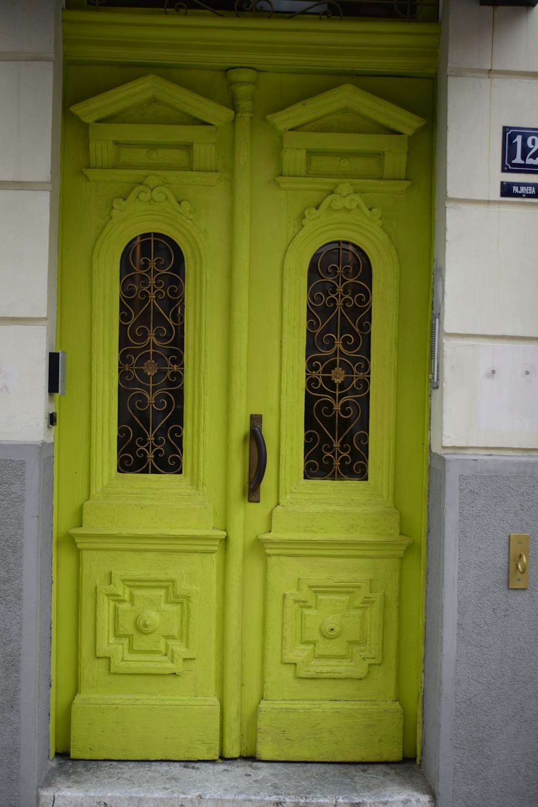
Norman Doors are everywhere, from office entryways to hotel restroom exits. Some classic examples include:
- Glass doors with identical handles on both sides—users can’t tell which side opens or how to operate it.
- Push bars on pull doors—users slam into them expecting the door to yield.
- Overuse of “Push” and “Pull” signs—a label shouldn’t be necessary if the design is clear.
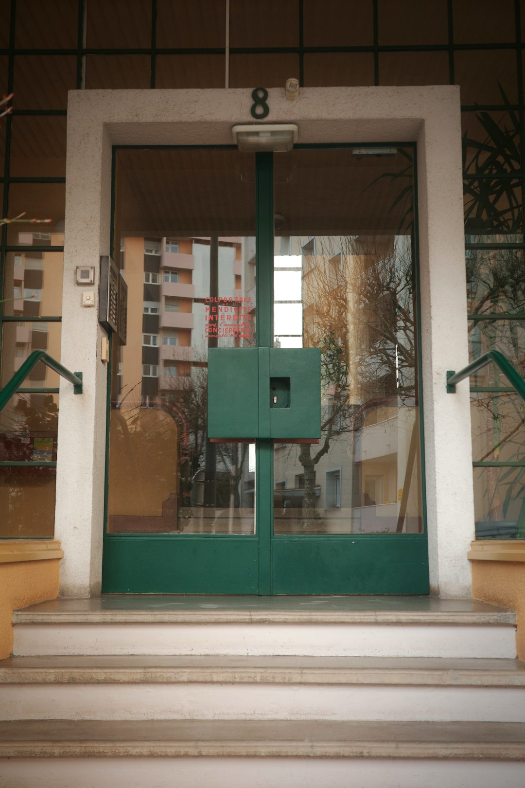
Often, buildings compensate with stickers like “Push” or “Pull”—but this is a band-aid solution. If a door needs instructions, it was designed poorly in the first place.
Fixing the Problem: Design Principles That Help
Improving design requires adopting usability principles that focus on human psychology and intuitive understanding. Here are key strategies:
- Use clear signifiers: Make it visually obvious how an object works.
- Design for affordance: The structure should suggest its function—like a flat plate that implies pushing.
- Consistency: Use familiar cues and align functionality with user expectations across all similar touchpoints.
- User testing: Observe how users interact with the design before finalizing it.
These principles, while simple, require deliberate application across every stage of a design process. Designers must think not just about how an object looks, but most importantly, how it feels to use.
Beyond Doors: The Broader Impact of Bad Design
Norman Doors may seem trivial, but they represent a broader issue: the lack of user-centered design in everyday life. Whether people are navigating software interfaces, public kiosks, or remote controls, poor design can cause daily frustration and waste time.
In digital environments, similar issues manifest as confusing button placements, unintuitive interactions, and lack of feedback. That’s why designers across fields—physical and digital—should study Norman Doors as metaphors for what not to do.
Learning from Mistakes
Recognizing a Norman Door is the first step in recognizing deeper design flaws. Once people attune themselves to these examples, they start noticing similar inefficiencies all around—from websites that hide key functions behind obscure menus, to confusing bathroom faucets with indistinguishable controls.
Design literacy—especially regarding usability—needs to become a core expectation in every discipline that shapes user experiences.
Conclusion
Norman Doors serve as a powerful lesson in human-centered design. They show that when products, interfaces, or architectures fail to communicate usage clearly, it’s not the user who’s at fault—it’s the design. With careful attention to affordance, signifiers, and natural mappings, designers can build not just better doors, but better worlds.
FAQ
-
What is a Norman Door exactly?
A Norman Door is a door designed in such a way that it gives the wrong visual or tactile cues, causing confusion about whether to push or pull it. -
Who coined the term “Norman Door”?
The term was coined by Don Norman, who is known for his work in design and usability, particularly through his book “The Design of Everyday Things.” -
How can Norman Doors be fixed?
By using clear signifiers and affordances, and aligning the design cues with the expected action—such as flat plates for push and handles for pull. -
Are Norman Doors just a physical design problem?
No, they’re a metaphor for broader usability issues found in physical and digital products alike. -
Why don’t designers avoid these issues?
Often because of a focus on aesthetics over usability, lack of user testing, or a failure to apply human-centered design principles.