Every new iPhone launch brings the same question: which color will everyone want first? With the iPhone 17 Pro, early trend signals suggest that color choice may be just as important as camera upgrades, chip performance, or display improvements. While official demand can only be measured once sales data becomes clearer, early chatter from leaks, preorder discussions, social media polls, accessory makers, and Apple fan communities already points toward a few standout finishes.
TLDR: Early trends suggest that the most popular iPhone 17 Pro colors are likely to be deep blue, titanium gray, and a warmer copper or bronze inspired finish. Classic neutral shades are expected to remain strong because they look premium and pair well with cases. However, the most talked-about color may be the one that feels newest, especially if Apple introduces a distinctive warm metallic tone for the Pro lineup.
Why iPhone Colors Matter More Than People Think
For many buyers, choosing an iPhone color is not simply about appearance. It is a small but personal decision that says something about style, taste, and even upgrade habits. A neutral color may suggest practicality and timelessness, while a bold new finish often signals that the owner has the latest model.
This is especially true for the Pro models. Apple’s Pro iPhones traditionally use more restrained, premium colors compared with the standard models. Instead of bright pinks, yellows, or greens, the Pro lineup often leans into graphite, silver, blue, gold, natural titanium, and darker metallic tones. That makes even subtle changes feel meaningful.
The iPhone 17 Pro is expected to continue this pattern, but early trends suggest buyers may be especially interested in colors that combine luxury with freshness. In other words, the most popular finish may not be the loudest one, but the one that looks clearly new without feeling risky.
1. Deep Blue: The Early Favorite Among Enthusiasts
If early online discussions are any indication, deep blue could become one of the most popular iPhone 17 Pro colors. Apple has had success with blue Pro finishes before, including Pacific Blue and Sierra Blue. These colors stood out because they were different from black or silver, yet still professional and elegant.
A darker blue finish would likely appeal to several types of buyers:
- Tech enthusiasts who want a color that looks new but still premium.
- Professionals who prefer something more distinctive than black, but not too flashy.
- Upgraders who want their phone to visibly differ from older models.
- Case minimalists who may use a clear case to show off the finish.
The reason deep blue works so well is its balance. In bright light, it can look rich and expressive. In darker settings, it can appear almost black, giving it a serious and refined character. That dual personality makes it appealing to buyers who want style without sacrificing sophistication.
Early trends also suggest that color nostalgia may play a role. Many Apple fans still mention Pacific Blue as one of the best Pro colors ever released. If the iPhone 17 Pro brings back a similar shade with a refreshed titanium or aluminum look, it could easily become a top preorder choice.
2. Titanium Gray: The Safe, Premium Choice
Neutral colors rarely dominate online hype, but they often dominate real-world sales. That is why titanium gray, or a similar natural metallic shade, is expected to be one of the strongest iPhone 17 Pro colors.
Apple’s move toward titanium styling in earlier Pro models helped create a softer, less glossy, more industrial look. Many buyers liked this direction because it made the phone feel lighter, tougher, and more modern. A gray titanium color fits perfectly with that design language.
Titanium gray is popular because it is practical. It hides fingerprints better than glossy black, looks clean with almost any case, and tends to age well. People who keep their phones for several years often choose colors like gray, silver, or black because they are less likely to feel dated.
Another advantage is resale value. Neutral iPhone colors usually appeal to the widest group of secondhand buyers. Someone buying a used Pro iPhone two years later may be more comfortable choosing gray than a bold seasonal color. For that reason, shoppers who think ahead may lean toward titanium gray even if another color looks more exciting at launch.
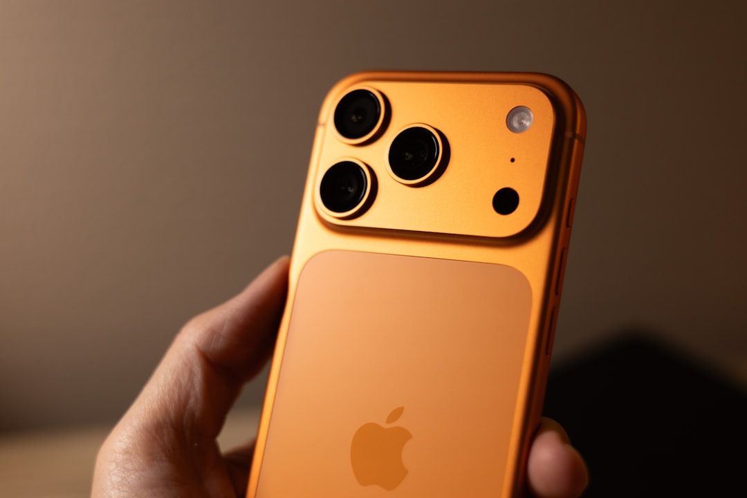
3. Copper or Bronze: The Most Talked-About New Look
One of the most interesting early trends around the iPhone 17 Pro is the possibility of a warm metallic finish. Whether described as copper, bronze, desert gold, or champagne titanium, this type of color has the potential to become the standout shade of the lineup.
Apple has often used one special color to define a Pro generation. Sometimes it is blue, sometimes green, sometimes a new titanium shade. A copper or bronze inspired finish would make sense because it feels premium, photographs well, and offers something different from the cooler gray and silver tones that have dominated recent Pro models.
This color could be especially popular with buyers who want:
- A luxury inspired finish that feels warmer than silver or gray.
- A new visual identity that clearly marks the phone as the latest model.
- A subtle alternative to gold without being too yellow or shiny.
- A color that looks good with brown, cream, black, or clear cases.
The key question is how Apple would execute the tone. If it is too orange, it may feel polarizing. If it is too pale, it may look too similar to champagne or beige. But if Apple finds the right balance, a copper bronze iPhone 17 Pro could become the color people ask for by name.
4. Space Black: Always Popular, Even Without the Hype
No matter how many new colors Apple introduces, black remains a powerhouse. A dark iPhone Pro finish is sleek, serious, and universal. It works for nearly everyone, which is why it often sells extremely well even when it is not the most discussed color online.
For the iPhone 17 Pro, a Space Black or near black finish would likely attract buyers who prioritize a minimalist look. Black makes the camera system appear more integrated, pairs perfectly with dark cases, and gives the phone a clean, high-end appearance.
However, black finishes can face one challenge: visibility of dust, smudges, and tiny scratches. Matte textures help reduce this issue, but some users still prefer gray or natural titanium because those colors are more forgiving. Even so, black is unlikely to fall out of favor. It is the smartphone equivalent of a black suit: not always surprising, but always appropriate.
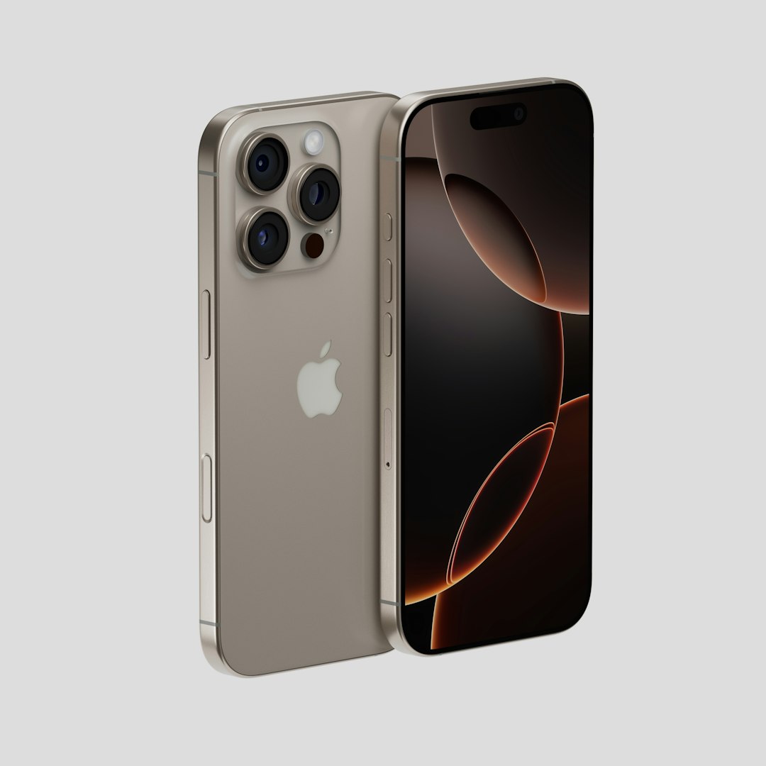
5. Silver or White Titanium: The Clean Classic
Silver and white toned finishes have long been part of Apple’s design identity. They look clean, bright, and unmistakably Apple. While silver may not generate the same excitement as a new blue or bronze shade, it remains one of the most dependable options for Pro buyers.
One reason silver stays popular is that it works beautifully with accessories. Clear cases, leather style cases, silicone cases, and metal camera rings all tend to look good with a lighter iPhone. Silver also makes the device feel crisp and modern, especially when paired with a bright display and thin bezels.
There is also a practical benefit: lighter finishes tend to show fingerprints and dust less obviously than darker ones. Scratches may also be less noticeable depending on the material and coating. For buyers who want a phone that continues to look fresh after months of daily use, silver remains a smart choice.
What Early Trends Say About Buyer Behavior
Early color trends usually come from a mix of speculation, social media excitement, search interest, and accessory planning. Case manufacturers often prepare for likely colors before launch, while online communities debate which finishes look most realistic or desirable. Although these signals are not the same as official sales numbers, they do reveal what buyers are emotionally responding to.
At this stage, the strongest pattern is clear: people want a Pro color that feels premium first and trendy second. Bright colors may perform well on standard iPhones, but Pro customers usually prefer restraint. They want a finish that looks expensive, photographs well, and fits into daily life without feeling childish or overly flashy.
This is why deep blue, titanium gray, bronze, black, and silver all make sense as top contenders. Each one offers a different kind of confidence. Blue offers personality. Gray offers durability and taste. Bronze offers novelty and warmth. Black offers elegance. Silver offers clarity and tradition.
Which Color Is Most Likely to Sell Out First?
If Apple introduces a genuinely new copper or bronze tone, that color may be the first to sell out during early preorder windows. New colors often create urgency because buyers worry they will be harder to find later. They also tend to receive more coverage from reviewers and influencers, which can amplify demand.
However, the color with the most long-term popularity may be titanium gray or deep blue. These shades have broader appeal and are less likely to divide opinion. A bronze finish might win the launch week conversation, while titanium gray may quietly become the everyday bestseller.
Here is a likely ranking based on early trend behavior:
- Deep Blue: Potential enthusiast favorite with broad appeal.
- Titanium Gray: Safest premium choice and likely long-term bestseller.
- Copper or Bronze: Most exciting if Apple executes it well.
- Space Black: Consistently popular, especially among minimalists.
- Silver or White Titanium: Classic, clean, and dependable.
How to Choose the Best iPhone 17 Pro Color for You
The best color is not always the most popular one. Before choosing, think about how you actually use your phone. If you always use a solid case, the color may matter less, though the camera ring and edges may still show. If you prefer a clear case or no case, the finish becomes much more important.
Choose deep blue if you want something stylish but not loud. Choose titanium gray if you want the safest all-around option. Choose copper or bronze if you enjoy having the color that feels most tied to the newest generation. Choose black if you like a sleek and understated device. Choose silver if you want a bright, classic Apple look.
It is also worth considering your accessories. Dark cases tend to pair best with black, gray, and blue. Clear cases show off bronze and silver especially well. Brown, tan, cream, and forest green accessories could look excellent with a warm metallic iPhone, while navy and charcoal cases would complement a deep blue model.
Final Thoughts
Based on early trends, the iPhone 17 Pro color race appears to be led by deep blue, titanium gray, and a possible copper or bronze inspired finish. Each of these colors fits a different kind of buyer, which is exactly why the Pro lineup remains so interesting. Apple does not need to make the Pro colors loud; it only needs to make them feel intentional, polished, and desirable.
If the early mood proves accurate, the most talked-about iPhone 17 Pro color may be the warm bronze option, while the most consistently popular choices may be deep blue and titanium gray. As always, the winning color will be the one that makes people feel like their new iPhone is not just upgraded on the inside, but unmistakably fresh on the outside too.