Putting two pictures side by side is one of the easiest ways to tell a better visual story. Whether you want to show a before-and-after, compare products, or create a fun social post, a side-by-side layout makes everything clearer and more eye-catching. The good news? You do not need fancy tools or design skills. You just need a simple idea and the right layout.
TLDR: Putting two pictures side by side helps you compare, contrast, and create more engaging social media posts. You can use simple tools like mobile apps, built-in collage features, or basic design software. Four creative layouts include classic split screen, framed comparison, storytelling sequence, and overlapping collage. Keep spacing clean, sizes balanced, and captions short for best results.
Why Put Two Pictures Side By Side?
Photos grab attention fast. But two photos? That doubles the impact.
Here is why this layout works so well:
- Clear comparison. Perfect for before-and-after shots.
- More context. Show two angles or moments at once.
- Better storytelling. One photo sets up the next.
- Social-friendly format. Ideal for Instagram, Facebook, and Pinterest.
It is simple. It is effective. And it is easy to execute.
Tools You Can Use
You do not need advanced design software. Many easy tools can do the job:
- Built-in phone gallery collage features
- Instagram layout mode
- Canva or similar online editors
- Basic photo editing apps
- Even PowerPoint or Google Slides
The key is alignment. Keep both images the same height or width for a clean look.
Now let us explore four creative layout ideas you can try today.
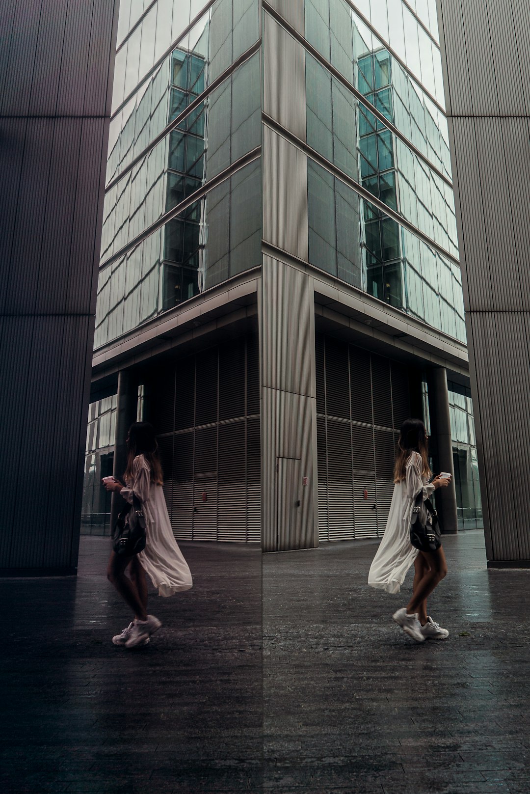
1. The Classic Split Screen
This is the most popular option. Two images. One vertical line down the middle.
Simple. Balanced. Powerful.
Best For:
- Before-and-after transformations
- Fitness progress
- Home renovations
- Makeovers
- Product comparisons
How To Create It:
- Choose two photos with similar size and orientation.
- Resize them to match dimensions.
- Place them edge to edge.
- Adjust brightness slightly so both look balanced.
Pro Tips:
- Keep the horizon level in both pictures.
- Avoid different color tones that clash.
- Add a thin white line between images for a modern touch.
This layout works because it makes comparison instant. Viewers do not need to think. They just see the difference.
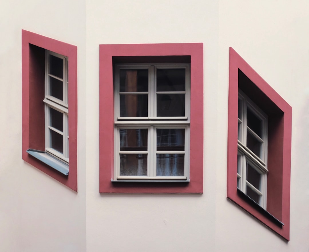
2. Framed Comparison Layout
Want something a little more stylish? Try adding frames.
Instead of placing photos directly next to each other, give each image breathing room with borders or background color.
Best For:
- Product showcases
- Travel photos
- Fashion styling comparisons
- Food photography
How To Create It:
- Open your design app.
- Choose a blank canvas.
- Select a grid with two equal columns.
- Add spacing between frames.
- Use a neutral background like white or light beige.
Creative Twist:
Add small captions under each image. Keep text short. For example:
- Day Look
- Night Look
This layout feels polished. It is great for professional brands or influencers.
The space around the images helps them stand out more. It feels intentional.
3. Storytelling Sequence (Left to Right)
Think of this like a mini comic strip. The first image sets the scene. The second shows what happens next.
This layout is perfect for creating emotion.
Best For:
- Event highlights
- Proposal stories
- Travel adventures
- Cooking processes
- Behind-the-scenes content
Example Ideas:
- Photo 1: Ingredients on a table
Photo 2: Finished dish - Photo 1: Empty room
Photo 2: Decorated space - Photo 1: Packing suitcase
Photo 2: Beach arrival
Design Tips:
- Keep lighting consistent.
- Crop both photos in the same ratio.
- Add a tiny arrow between them for flow.
This layout creates movement. It feels dynamic. It makes viewers curious.
And curiosity keeps people scrolling.
4. Overlapping Collage Style
Now we are getting playful.
Instead of placing images evenly side by side, overlap them slightly. One image can be larger. The other slightly tilted.
This layout feels creative and modern.
Best For:
- Lifestyle content
- Travel memories
- Artistic portfolios
- Memory recaps
How To Design It:
- Place the main image as your base.
- Add the second image on top.
- Shrink it slightly.
- Add a shadow effect underneath.
- Rotate it just a few degrees.
Important:
Do not overdo it.
Too much tilt looks messy. A little angle looks intentional.
This style works great for Instagram and Pinterest. It feels less rigid and more personal.
How To Choose The Right Layout
Not every layout works for every purpose. Ask yourself:
- Am I comparing something?
- Am I telling a story?
- Do I want clean or creative?
- Is this casual or professional?
If your goal is clarity, choose split screen.
If your goal is style, choose framed layout.
If your goal is emotion, choose storytelling sequence.
If your goal is creativity, pick overlapping collage.
Best Sizes For Social Media
Each platform has its own sweet spot.
- Square: 1080 x 1080 px
- Portrait: 1080 x 1350 px
- 1200 x 630 px works well
- 1000 x 1500 px vertical layout
Make sure both images inside your layout match proportions. Otherwise one may look stretched.
Common Mistakes To Avoid
Even simple layouts can go wrong. Watch out for these:
- Mismatched lighting. One bright. One dark. Looks unbalanced.
- Different color tones. Warm vs cool can clash.
- Uneven spacing. Keep margins consistent.
- Too much text. Images should speak first.
- Low resolution images. Blurry photos reduce engagement.
Keep it clean. Keep it balanced.
Extra Creative Enhancements
Want to level up your layout? Try these ideas:
- Add a subtle gradient overlay to both images for cohesion.
- Use matching filters.
- Place a short headline across the center seam.
- Add icons or small arrows.
- Use brand colors as background.
Small details make a big difference.
When To Use Side By Side Posts
This format shines in specific situations.
- Launching a new product version
- Showcasing improvements
- Sharing testimonials
- Highlighting transformation journeys
- Posting comparison reviews
People love visible progress. They trust what they can see.
Final Thoughts
Putting two pictures side by side is simple. But it is powerful.
You do not need complex software. You do not need design training. You just need:
- Two strong images
- A clear purpose
- A clean layout
Start with the classic split screen. Then experiment with frames. Try storytelling. Play with overlapping styles.
Keep it balanced. Keep it sharp. Keep it simple.
Your audience will notice the difference immediately.
Now open your favorite app and try one of these layouts today.